Overview
McGill's Furniture, a traditional mom-and-pop store located in Roxborough, Philadelphia, has been serving customers for over 50 years with its high-quality furniture and personalized assistance from their interior designers. Unfortunately, the store faced a six-month closure during the pandemic.
During a solo, intensive three-week sprint, my primary task as a designer was to enhance their online presence with e-commerce capabilities, aimed at boosting online sales.
To ensure a user-centric approach, I followed the Design Thinking methodology, beginning with comprehensive user and market research. This allowed me to create a smooth user experience with well-structured information architecture, wireframes, and prototypes. I conducted usability studies, prioritized accessibility, and actively sought user feedback. This iterative approach led to continuous improvements and refinements.

Design Process
1. Empathize with Users
User Research
To gain valuable insights into users' online and in-person furniture buying behavior, I conducted 9 user interviews to better understand their preferences and needs. The participants in the study ranged from 21 to 50 years old, and the target audience primarily consisted of individuals who had recently shopped for furniture either online or in person.
All participants displayed significant variations in their level of online shopping experience, yet they shared several common key tendencies.
User insights
- Buying Furniture online due to quarantine restrictions.
- Reliance on reviews when making furniture purchases.
- A strong preference for a guest checkout option during the purchasing process.
- Confusion caused by an excessive number of subcategories.
- Averse to required sign-ups, which can act as a deterrent.
- Positive reception towards ernative payment methods like PayPal.
Pain points
- The product appearing differently once received than it had looked online.
- The return process being cumbersome.
Heuristic evaluation
I also evaluated the store's current website with some of interviewed users and identified the following points:
- The website's look and feel is dated.
- The website lacks an e-commerce function.
- In some cases, low quality images have been used.
- It lacks a strong hierarchy in its design.
- The website lacks testimonials.
- Newsletter subscription popup appears when users first open the website, even though there is no newsletter subscription option available on the website.
Market research
During the same interview, users were asked to name the furniture websites they have recently visited or made purchases from and share their positive or negative experiences with those websites. Among the participants, three brands were mentioned the most. I conducted an analysis of these brands to gain insights into their strengths and weaknesses.

Competitive Analysis
During our research phase, we conducted a competitive analysis to explore the current market. Our goal was to identify valuable features offered by competitors that align with the needs of our interviewees. Through this analysis, we determined that language exchange would be an ideal feature to fulfill our users' requirements.
In conducting the analysis, I focused on the key aspects of the three mentioned brands' websites:
- Site navigation
- Item categorization
- Checkout process
The objective was to identify standard features and areas for improvement in information architecture and e-commerce functionality.
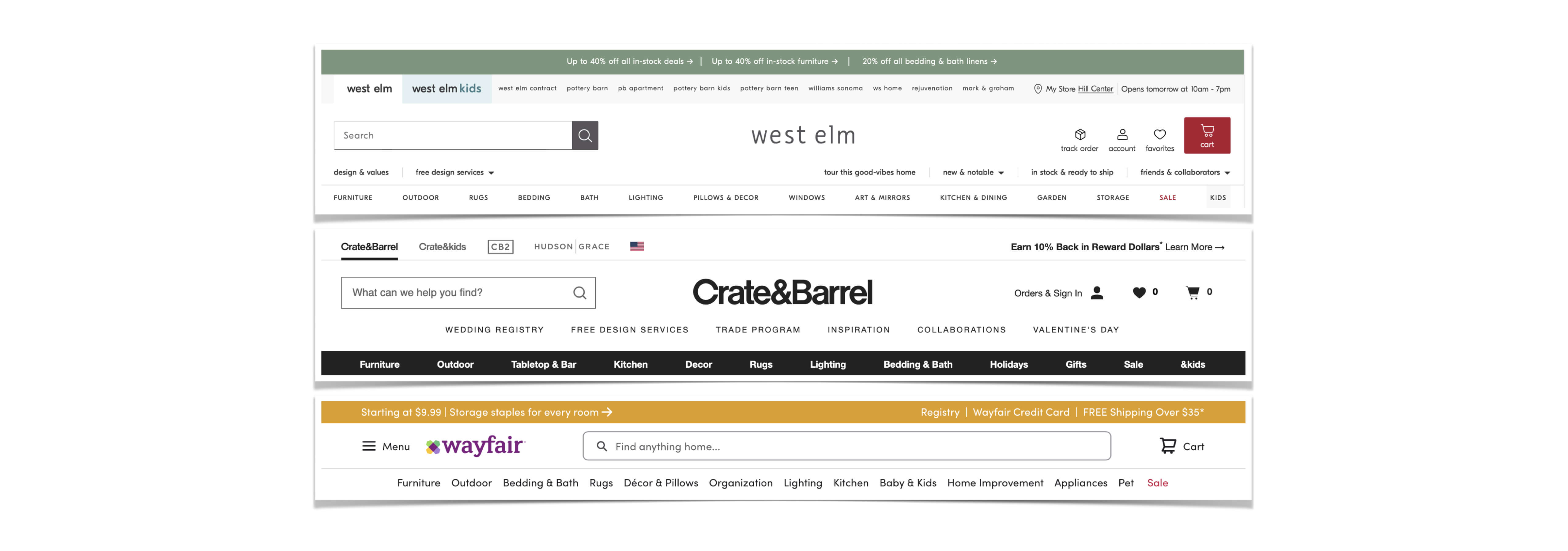
Highlighting sale products on site navigation is common among all three
Task analysis
To identify potential usability issues, user needs, and pain points, I also conducted task analysis which can then be addressed in the design and development process to create a more user-friendly and efficient experience.
The given task was to order a dining table through a guest checkout.
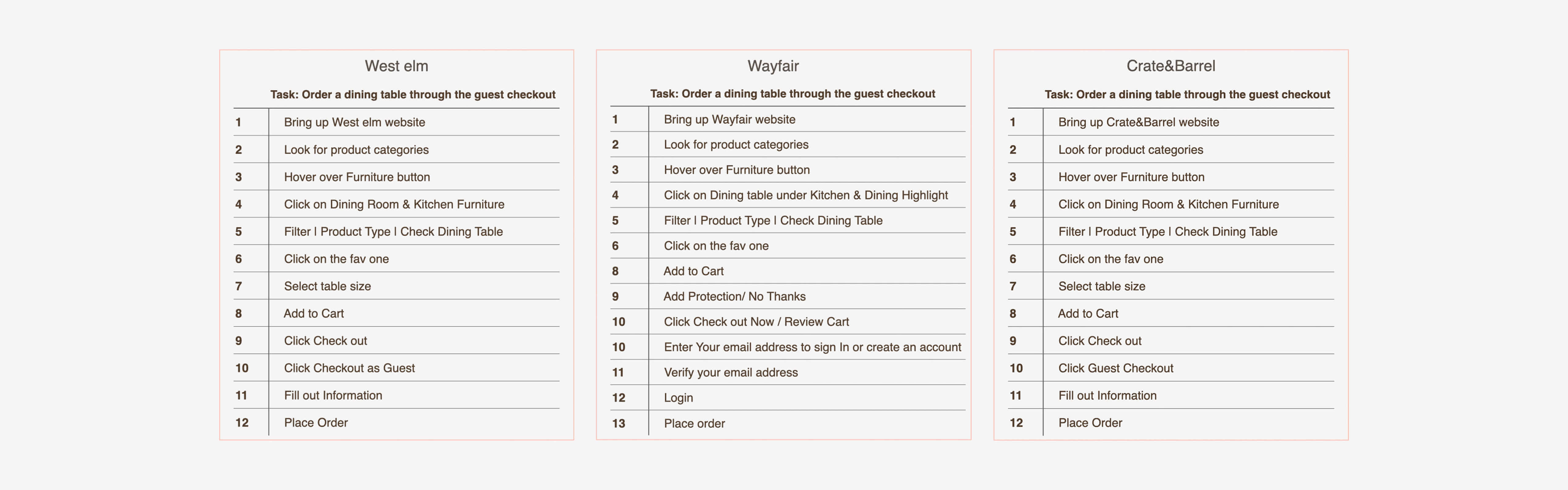
Wayfair does not have guest checkout and users have to create an account to be able shopping.
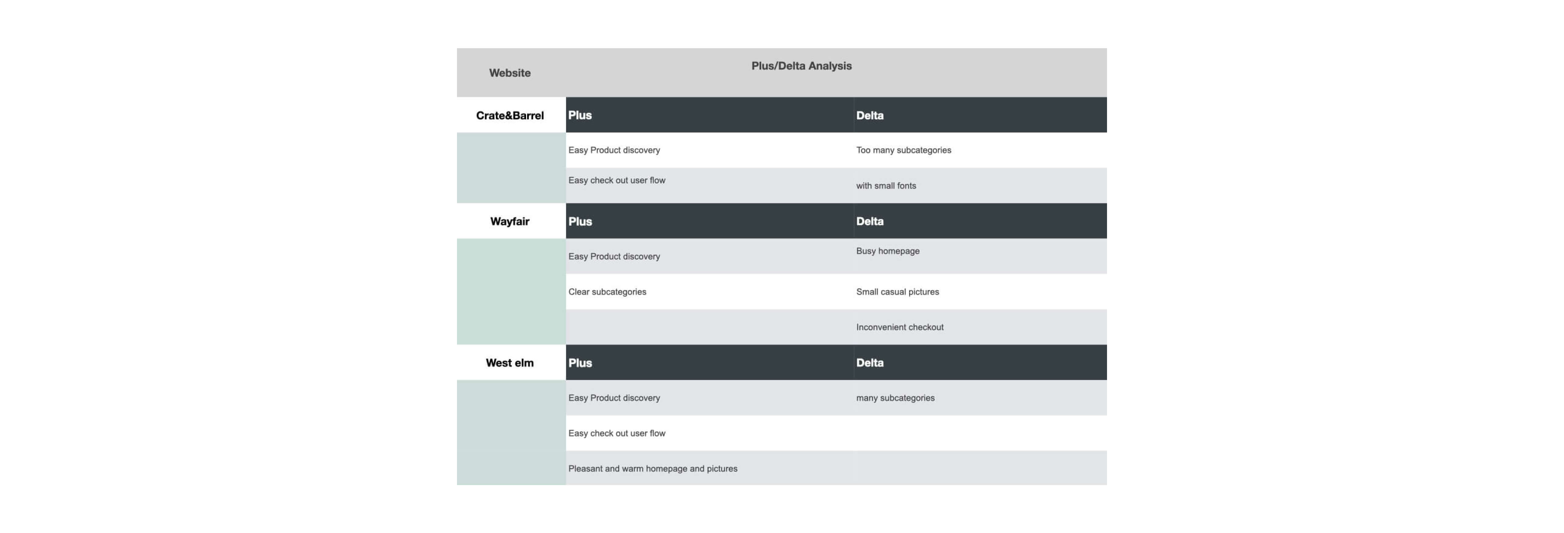
Plus/Delta analysis
As shown in the plus/delta analysis, my interviewees frequently mentioned their dislike for too many subcategories. It became evident that having an excessive number of subcategories can be quite confusing, especially for a small business with hundreds of products. Upon further examination, it was revealed that this level of subcategorization is not truly necessary and may negatively impact the user experience, leading to frustration and potential drop-offs.
2. Define the Problem
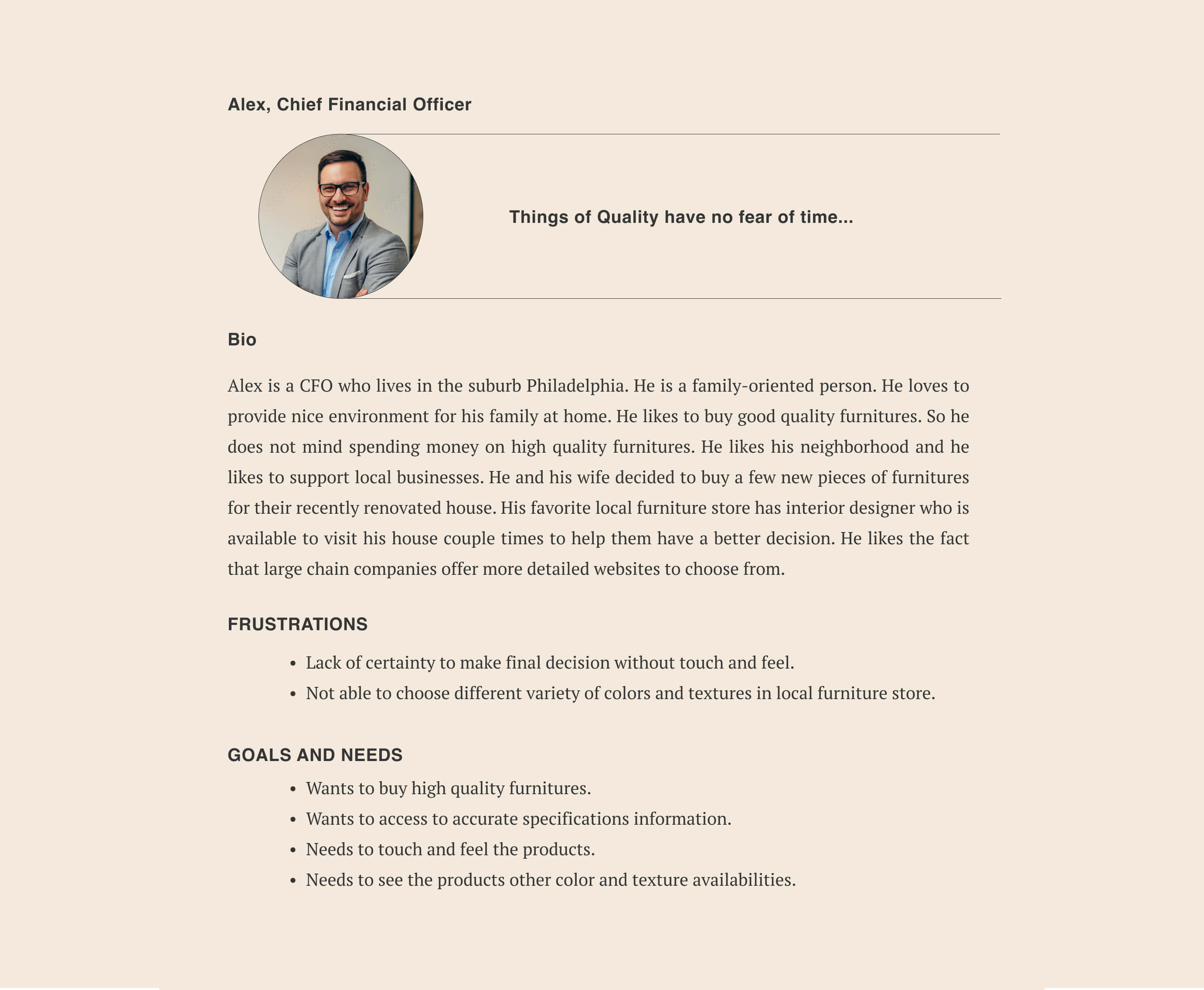
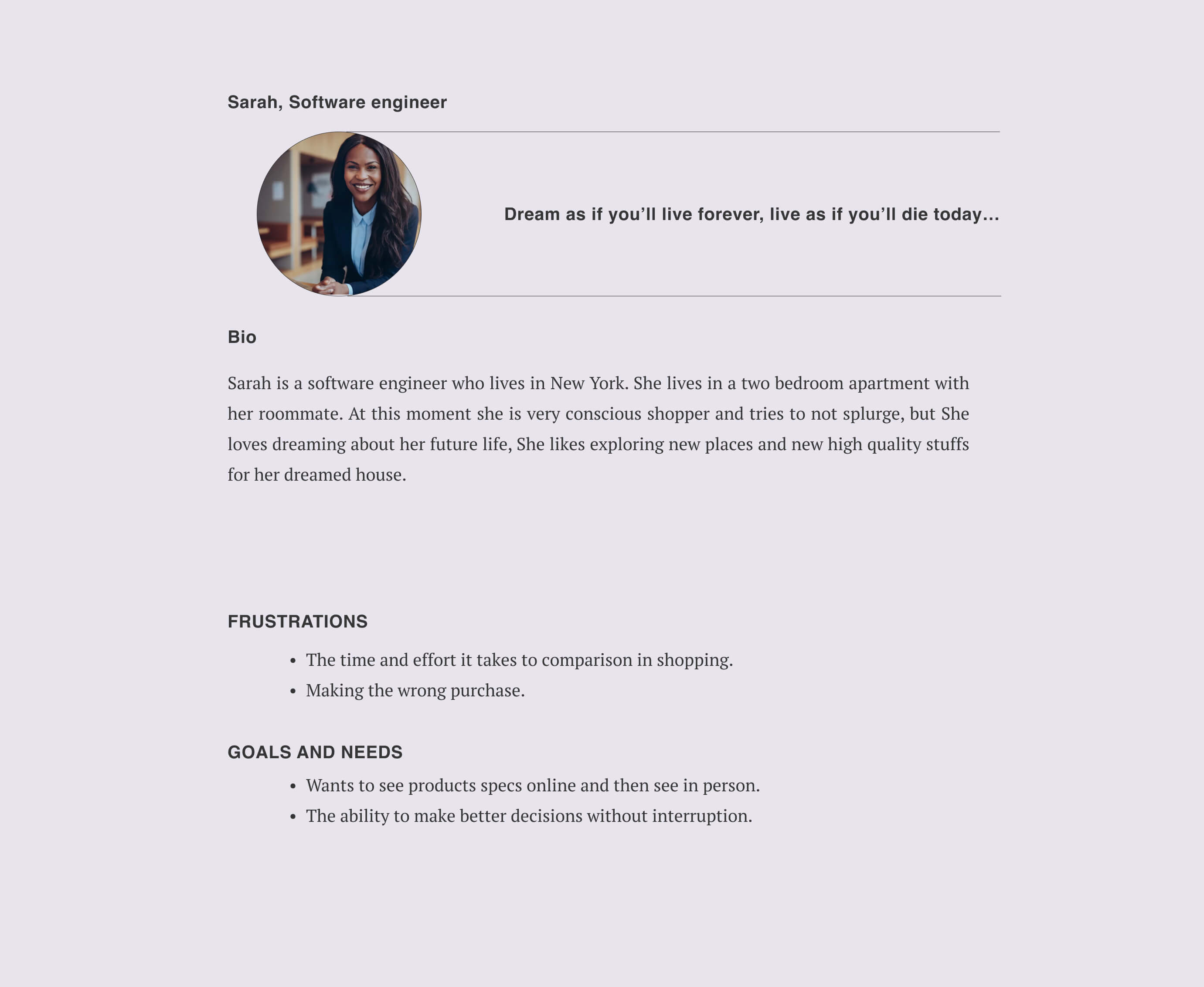
By creating personas that represent distinct user groups with unique needs, goals, and pain points, I was able to keep the users at the center of the design and development decisions. These personas served as a reference point throughout the entire product development journey, helping me empathize with the users, understand their motivations, and tailor the product to meet their specific requirements.
3. Ideate and Develop the Solution
Proposed solutions
- Online shopping for users in quarantine.
- Authentic testimonials for informed purchases.
- Guest checkout for efficiency.
- Simple categorization to reduce confusion.
- Simple categorization to reduce confusion.
- Optional account creation for convenient future purchases.
- Secure payment options, like PayPal.
- High quality product imagery with detailed descriptions.
- Implement a user-friendly return policy.
- User-friendly return policy.
Establishing categories and sub categories
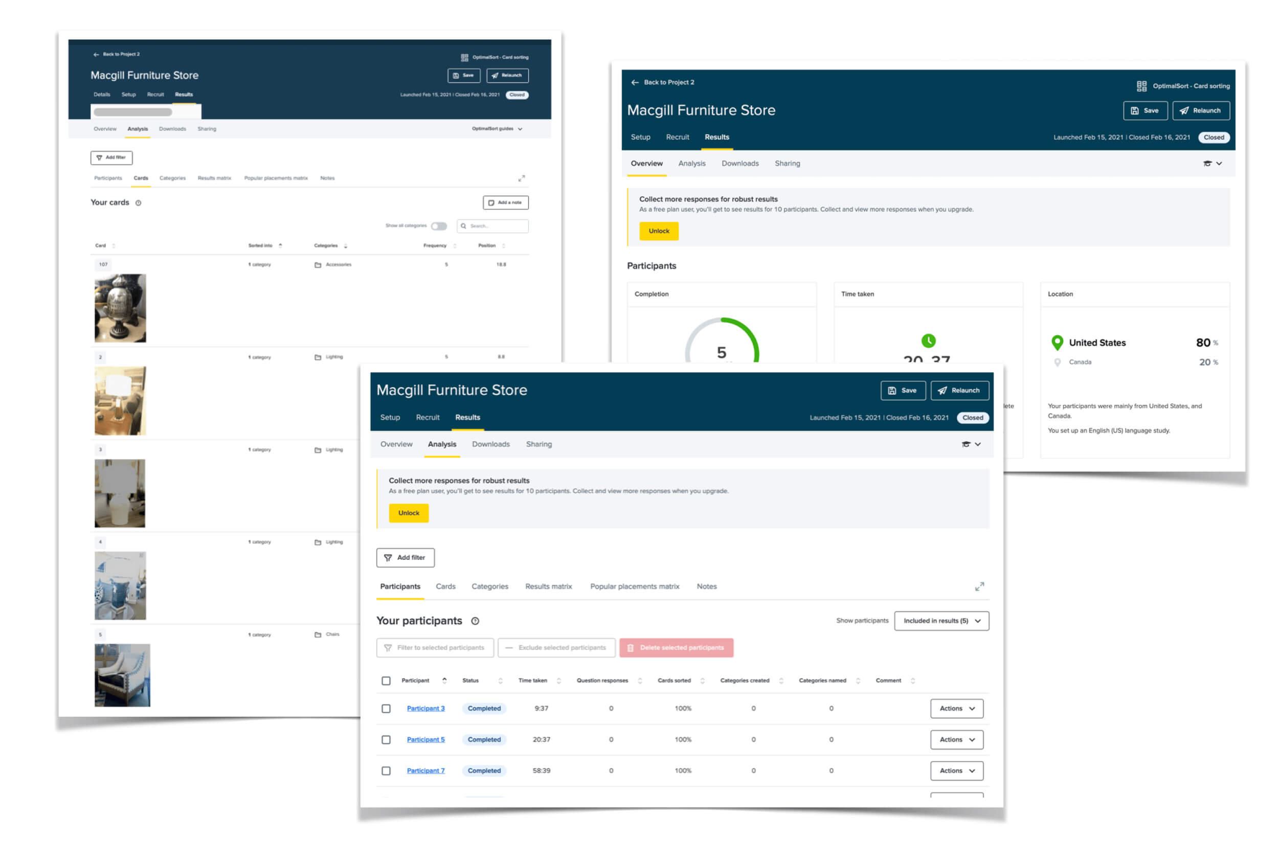
I conducted remote card sorting using Optimal Workshop to define product categories and subcategories. Open card sorting with participants provided insights into how users naturally categorized products. Combining user input with competitor categories, I established mutual categories. In the closed card sorting phase, predefined categories were used, and nearly all participants correctly categorized items. This validated the information architecture, aligning it with user mental models for an intuitive website structure.User flow
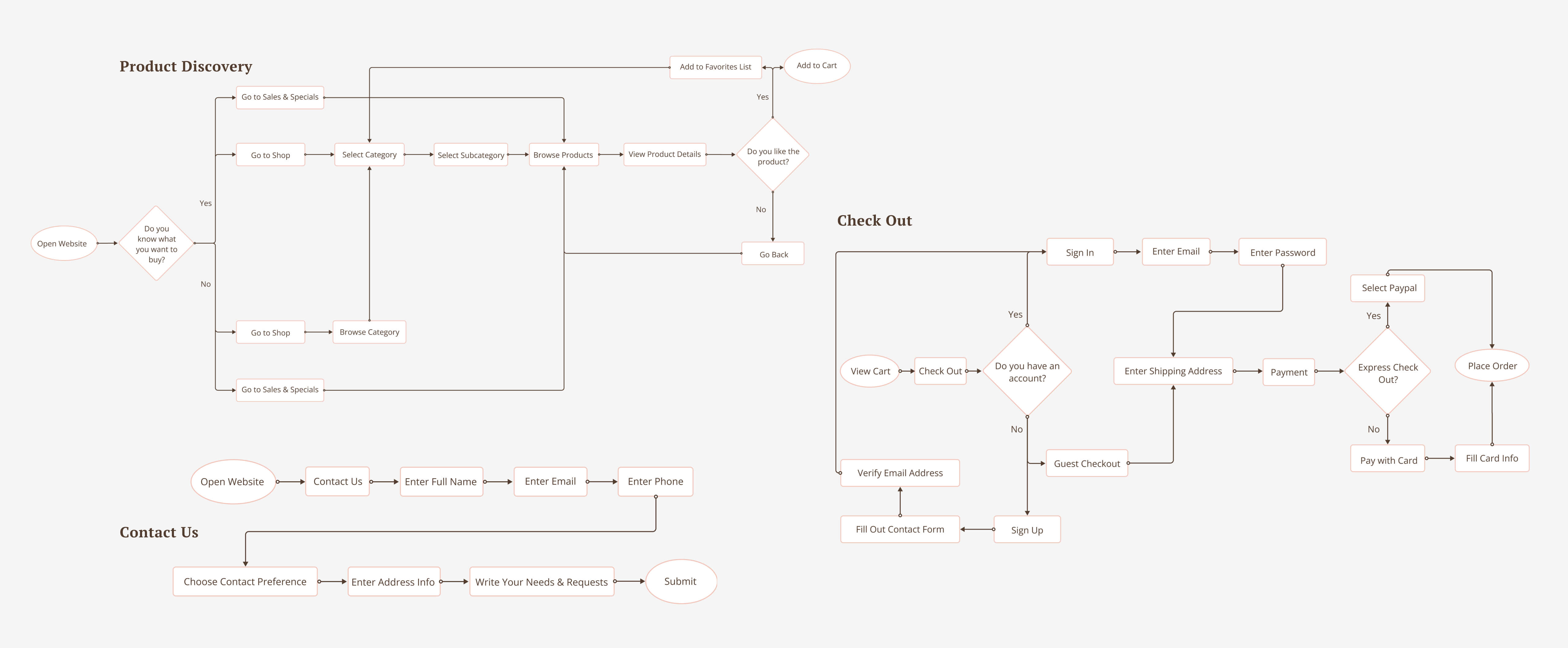
For this case study, I outlined three user flows: Product Discovery, Checkout, and Contact Us. These flows will be fully developed in the interactive prototype.
Site map
The sitemap was developed to gain insights into customer interactions and navigation on the online shop. The objective was to strategically improve information architecture, simplifying the user experience for easy browsing and interaction on the website.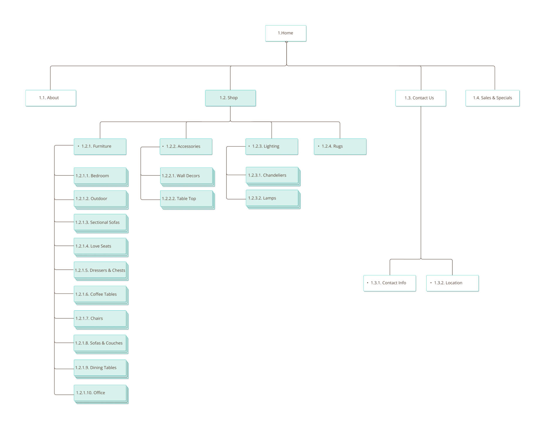
Information hierarchy
Next, I hand-sketched low-fidelity wireframes to establish an optimal information hierarchy that addresses potential users' pain points.

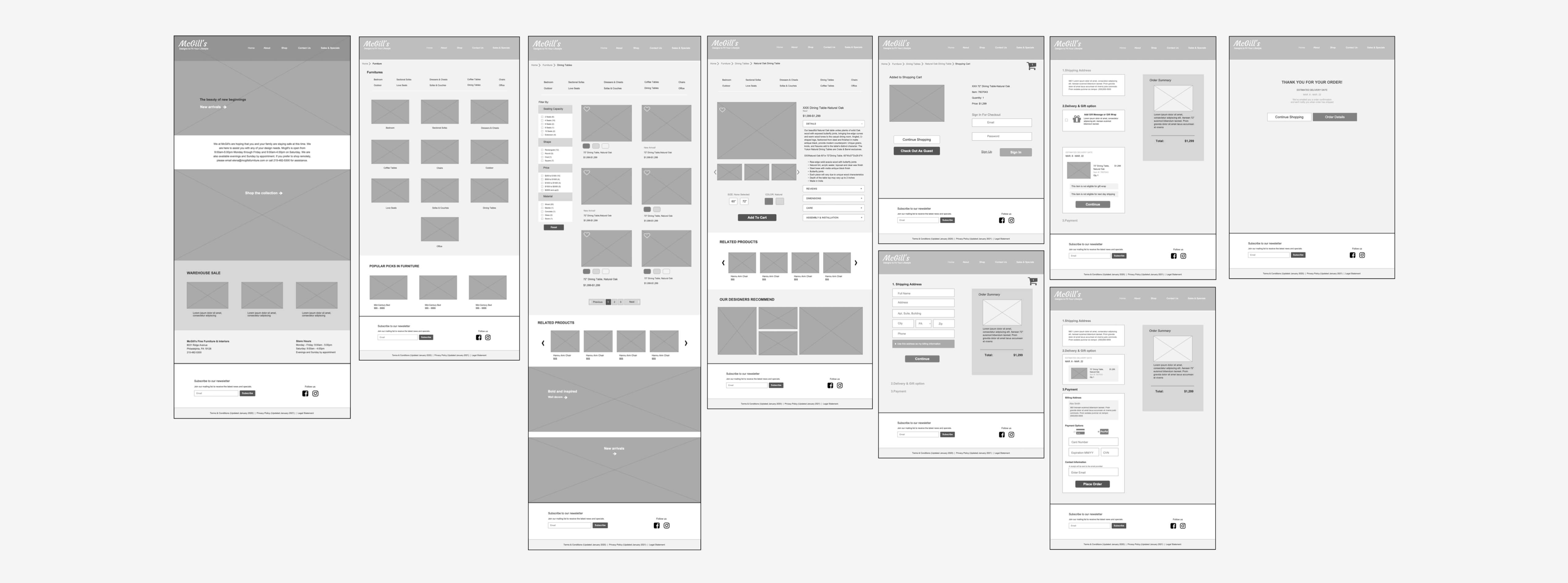
4. Prototype
The sitemap was developed to gain insights into customer interactions and navigation on the online shop. The objective was to strategically improve information architecture, simplifying the user experience for easy browsing and interaction on the website.
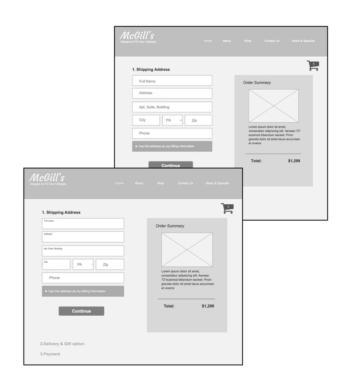
First Iteration
During the first usability test, I observed potential confusion among users when filling out the fields as the titles disappeared upon interaction. To address this issue, I redesigned the page so that when users click on a field, the title moves to the upper corner instead, providing a more intuitive and user-friendly form-filling experience.
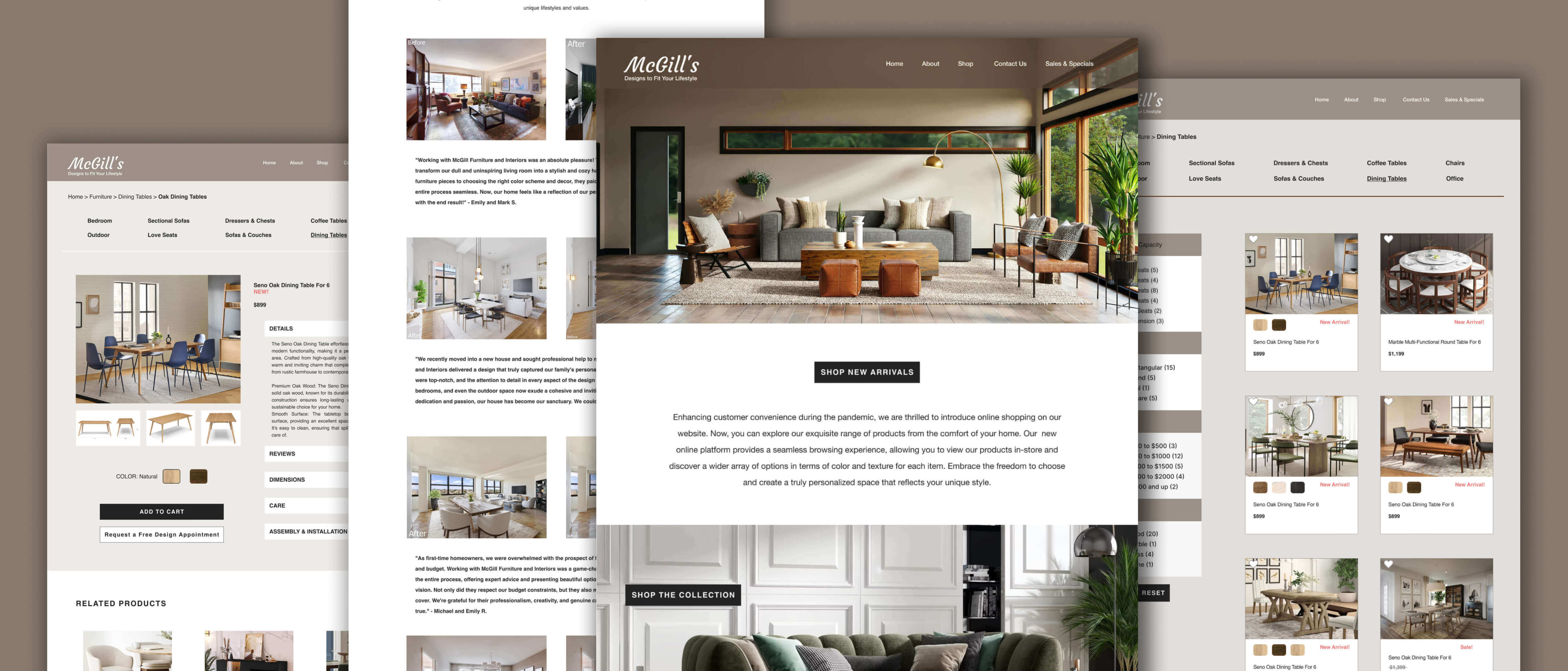
High-fidelity Mockups
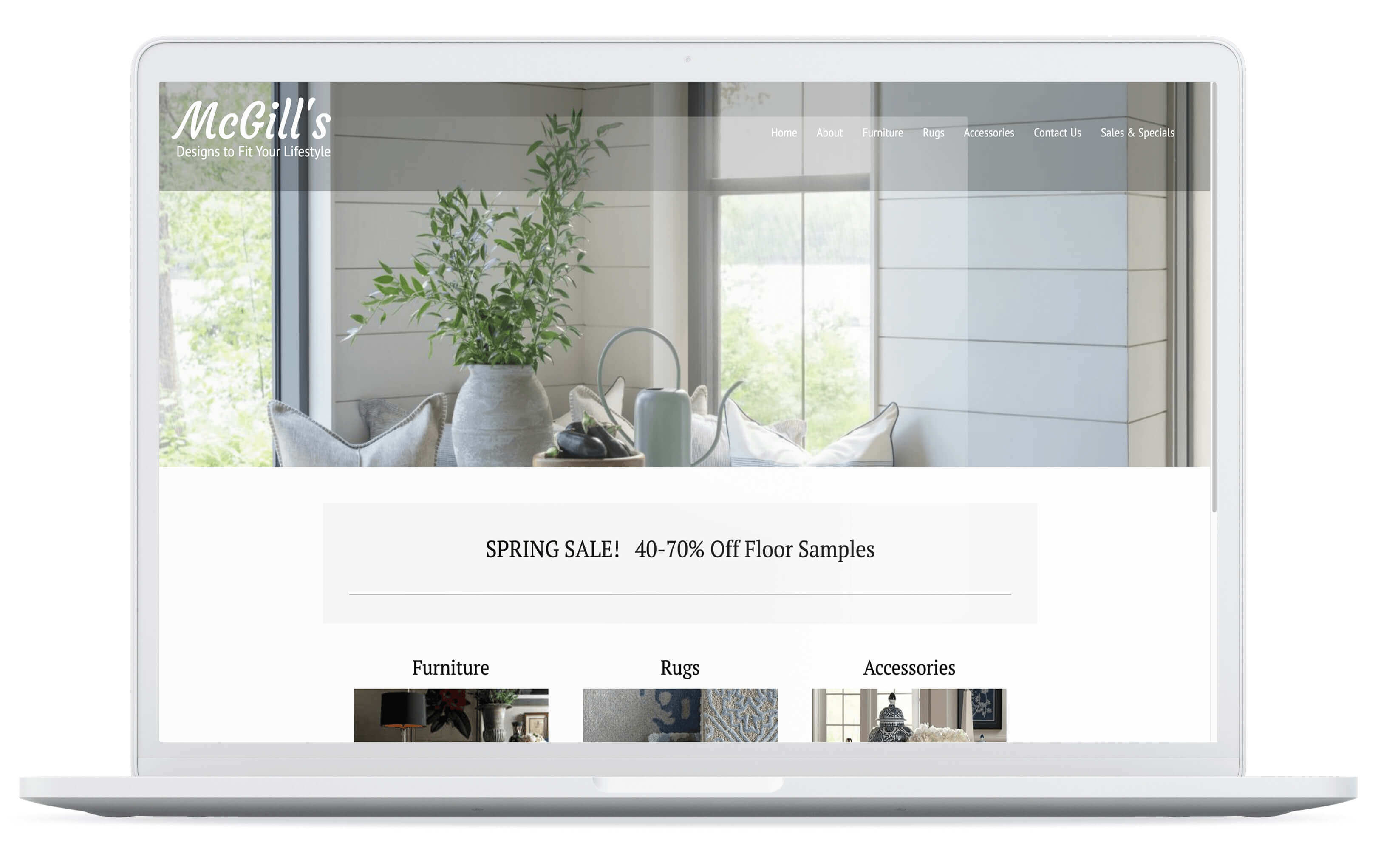
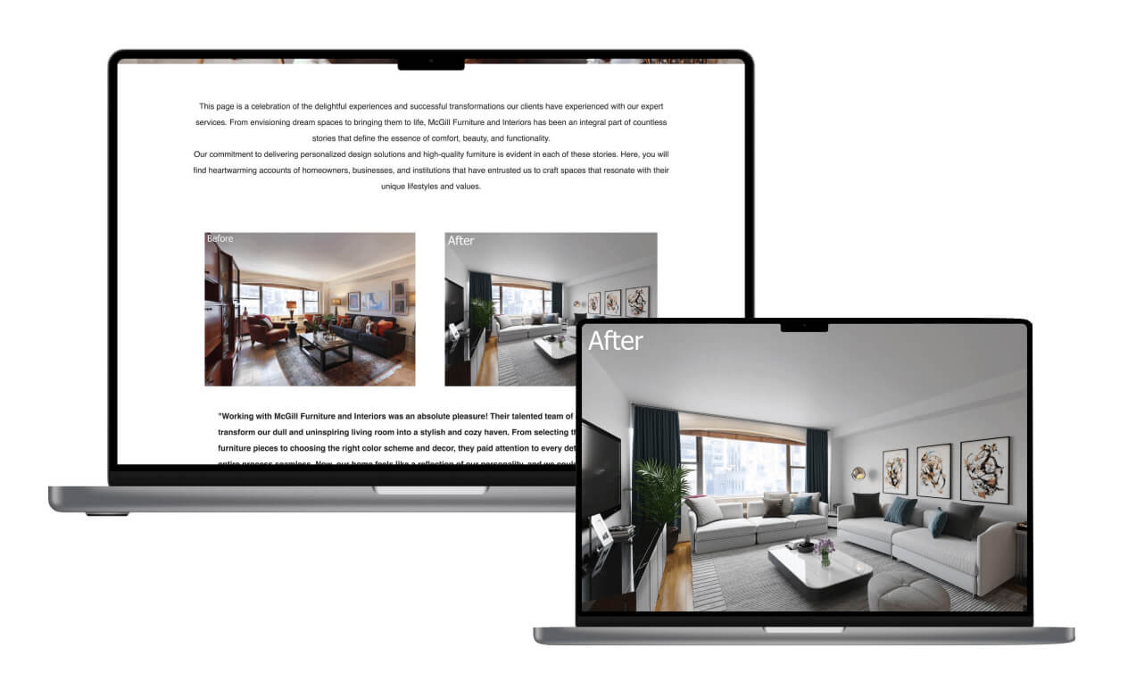
Upon progressing in the design process, I transitioned to creating high-fidelity mock-ups using Figma. With a focus on achieving a high-quality prototype, I carefully refined the visual elements, incorporating precise details, colors, and typography to create a polished and realistic representation of the final product.
5. Testing our Design
We conducted a second round of testing to uncover potential usability issues with the prototype.
Due to the limited time available during the project's completion, I conducted a limited number of user tests. Despite the constraints, the tests revealed significant improvements in the design. However, all tested users successfully completed all three tasks given in the prototype within a reasonable amount of time.
Iterations resulting from the usability test sessions
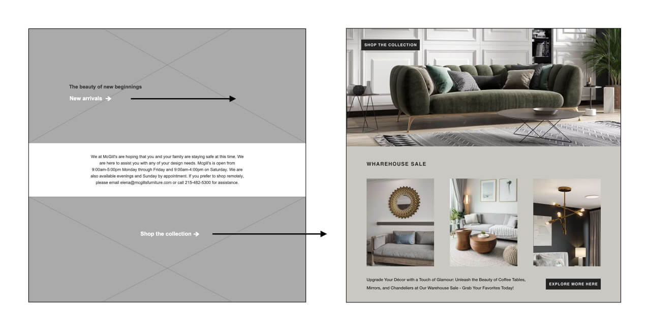
While observing user behavior, I noticed that none of the users were inclined to click on the arrows leading to the purchase. To address this, I replaced the arrows with a button featuring high color contrast compared to the colors on the page. This change aimed to enhance the visibility and encourage users to take action more effectively.
Iterations resulting from the usability test sessions
While observing user behavior, I noticed that none of the users were inclined to click on the arrows leading to the purchase. To address this, I replaced the arrows with a button featuring high color contrast compared to the colors on the page. This change aimed to enhance the visibility and encourage users to take action more effectively.
Final Results
This project taught me the importance of conducting user research alongside market research in the e-commerce experience. User feedback played a vital role in refining the project. Designing for a diverse user base posed challenges, requiring simplicity in design for broad appeal and usability.
I also realized that even minor design changes can significantly impact the user experience. Gathering user feedback was crucial in overcoming a single viewpoint when working alone.
Given the time constraints of the 3-week sprint, I acknowledge that the number of usability tests conducted was limited. However, staying focused and effectively utilizing time management skills were essential in handling the project scope.
Potential Future Enhancements
Looking ahead, the next steps for this project involve conducting follow-up usability testing on the new website to ensure its effectiveness. Seeking more user feedback to further improve and validate the design will also be a crucial aspect of the next phase. Additionally, identifying any other areas of need and engaging in ideation to explore new features will be considered to further enhance the user experience. This iterative process will contribute to creating a user-centric and successful e-commerce platform that meets the needs and expectations of the target audience.