Overview
This case study is a capstone project from General Assembly bootcamp that focuses on the UX design process. I will be applying the theoretical and practical knowledge I gained from my coursework and previous academic experiences. The assignment was to discover and design a new feature for the existing app in the span of 2 weeks..
The problem: Babbel is a subscription-based language learning app and e-learning platform. Babbel excelled in introducing users to new languages; however, they experienced challenges in retaining intermediate and advanced users.
The solution: By employing design thinking, we addressed user needs and incorporated a language exchange feature based on user research. Our final deliverable is a functional prototype that facilitates user connections with native or proficient speakers of their target language
My role: As a UX designer, I worked on all aspects of the design process alongside my teammates, including user and market research, layout design, prototyping, and user testing

Design Process
1-Empathize with Users
User Research:
In user interviews, we identified needs and potential areas for additional features. We interviewed 7 users from diverse language backgrounds to evaluate cross-cultural and cross-language user experience.
-
Key findings from the interviews:
- Users found language learning apps helpful, but not sufficient for achieving conversational fluency
- Subtitles aided comprehension of movies in a new language
- Speaking with others was considered the most effective way to learn a language
- Lack of practice hindered users' confidence in speaking the new language
- Some interviewees benefited from practicing with native speaker friends.
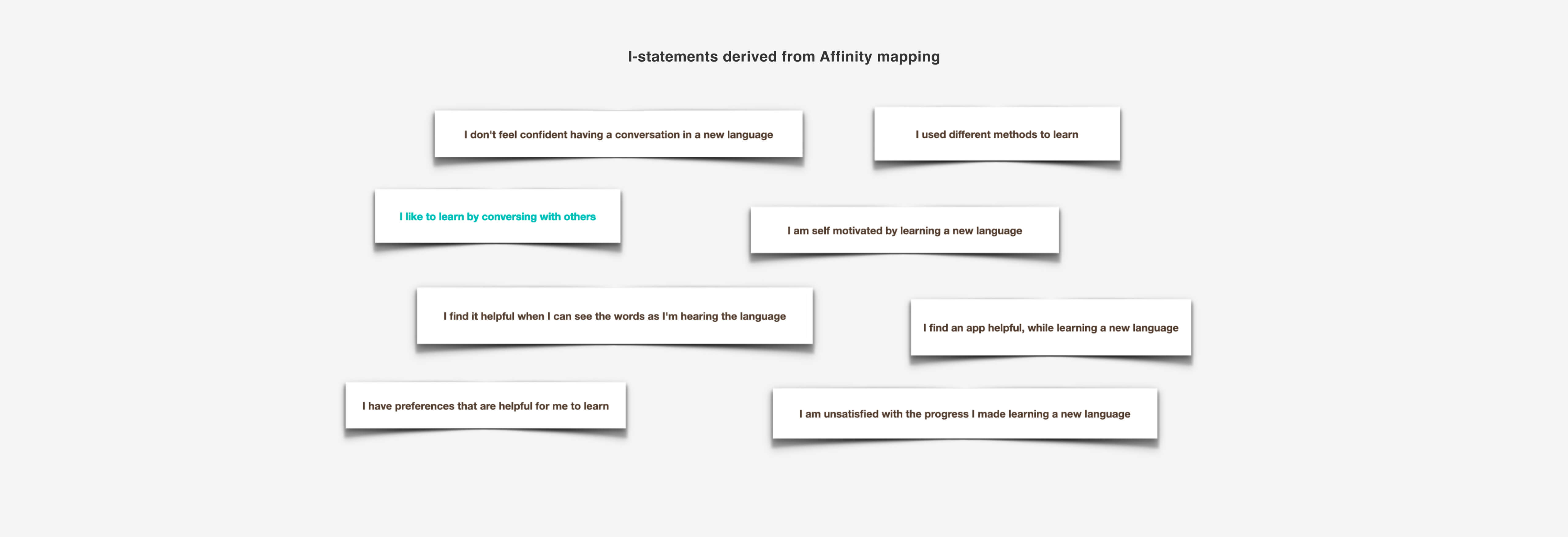
These insights shaped our approach to addressing user needs.
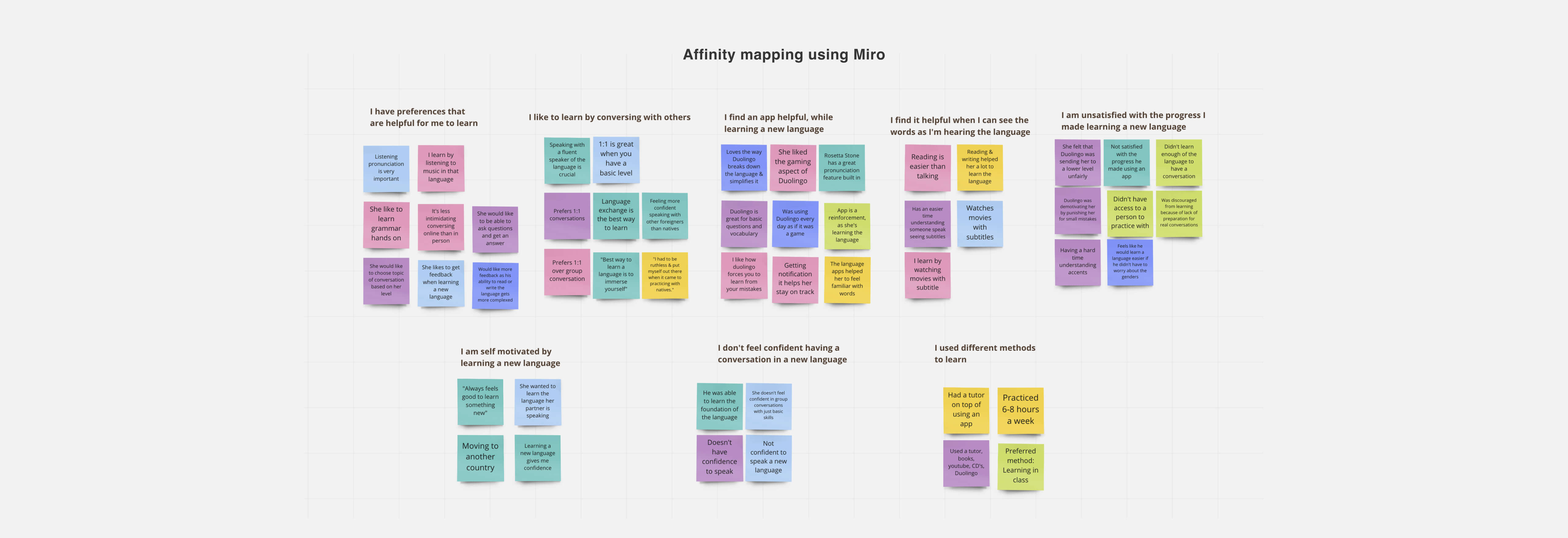
Analysis of interview scripts confirmed that users don t feel confident conversing in a new language after using language learning apps.
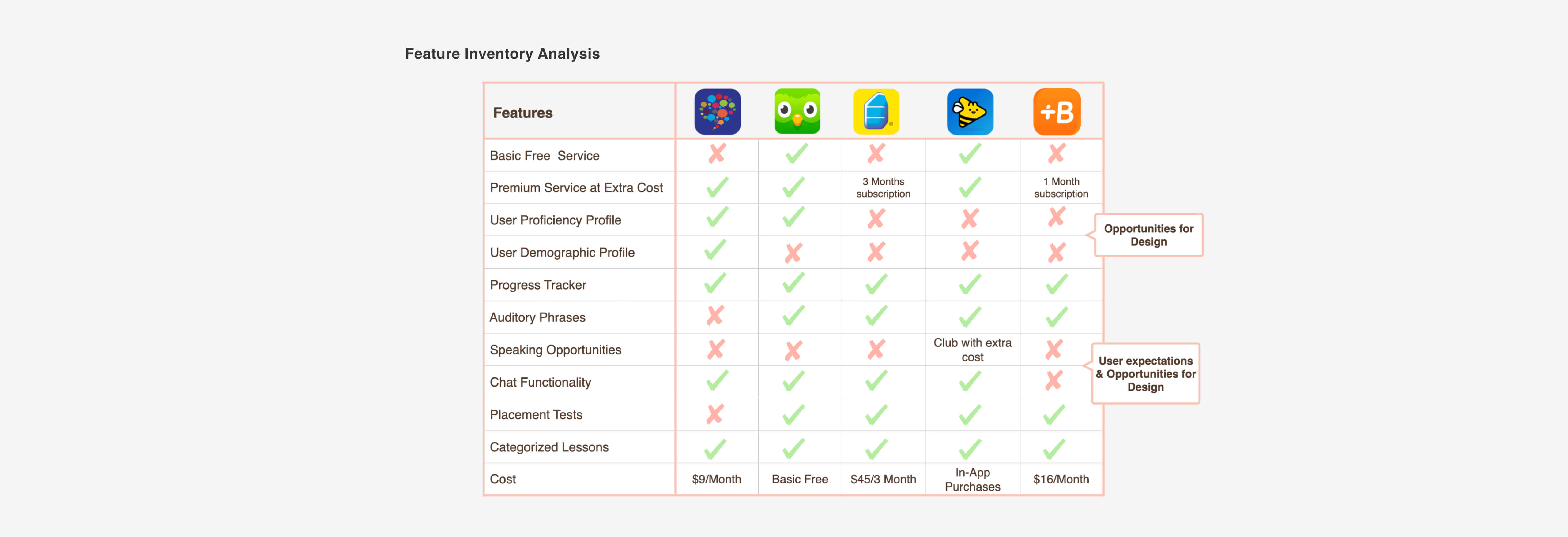
Competitive Analysis
During our research phase, we conducted a competitive analysis to explore the current market. Our goal was to identify valuable features offered by competitors that align with the needs of our interviewees. Through this analysis, we determined that language exchange would be an ideal feature to fulfill our users' requirements.
2-Define the Problem
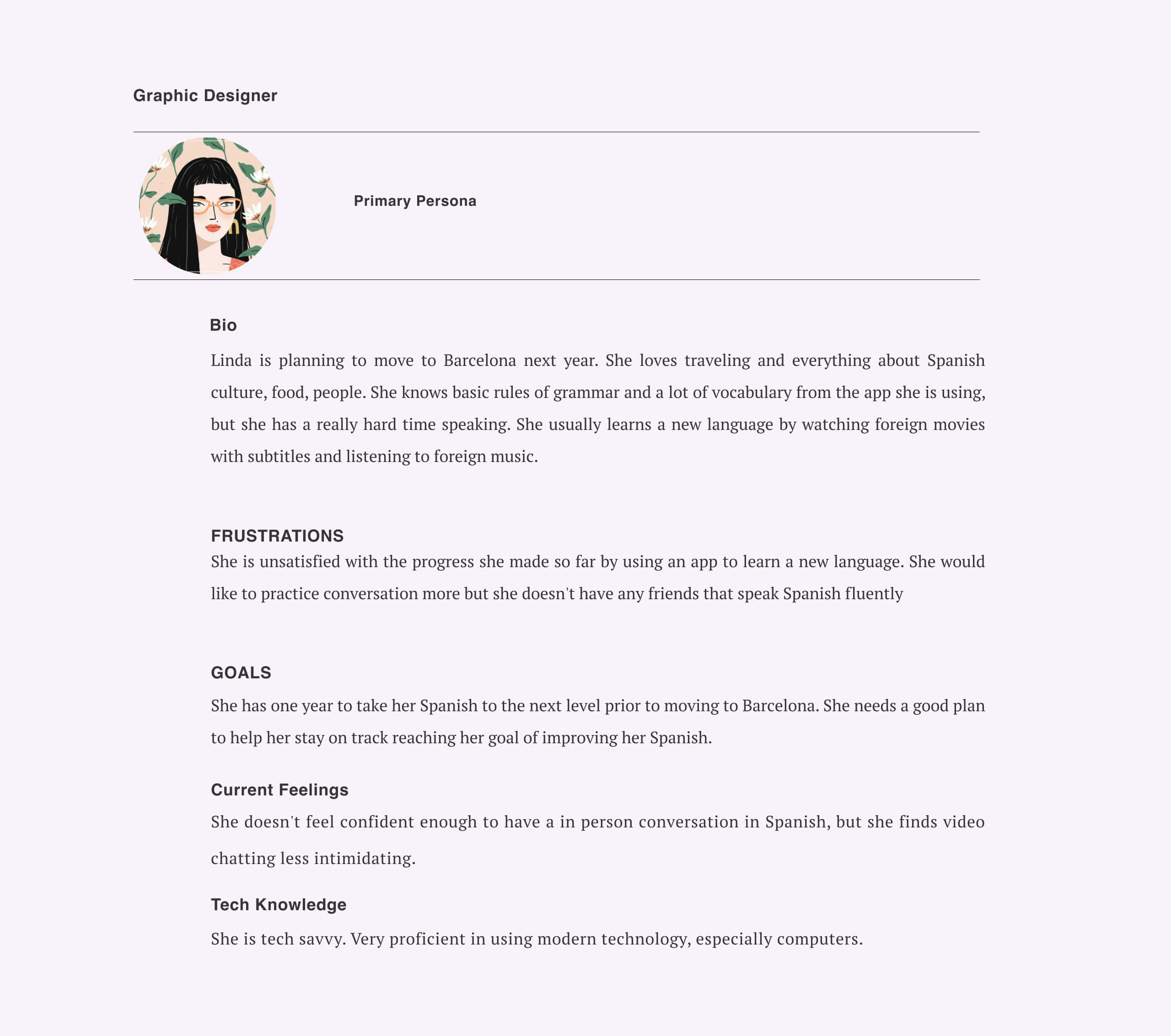
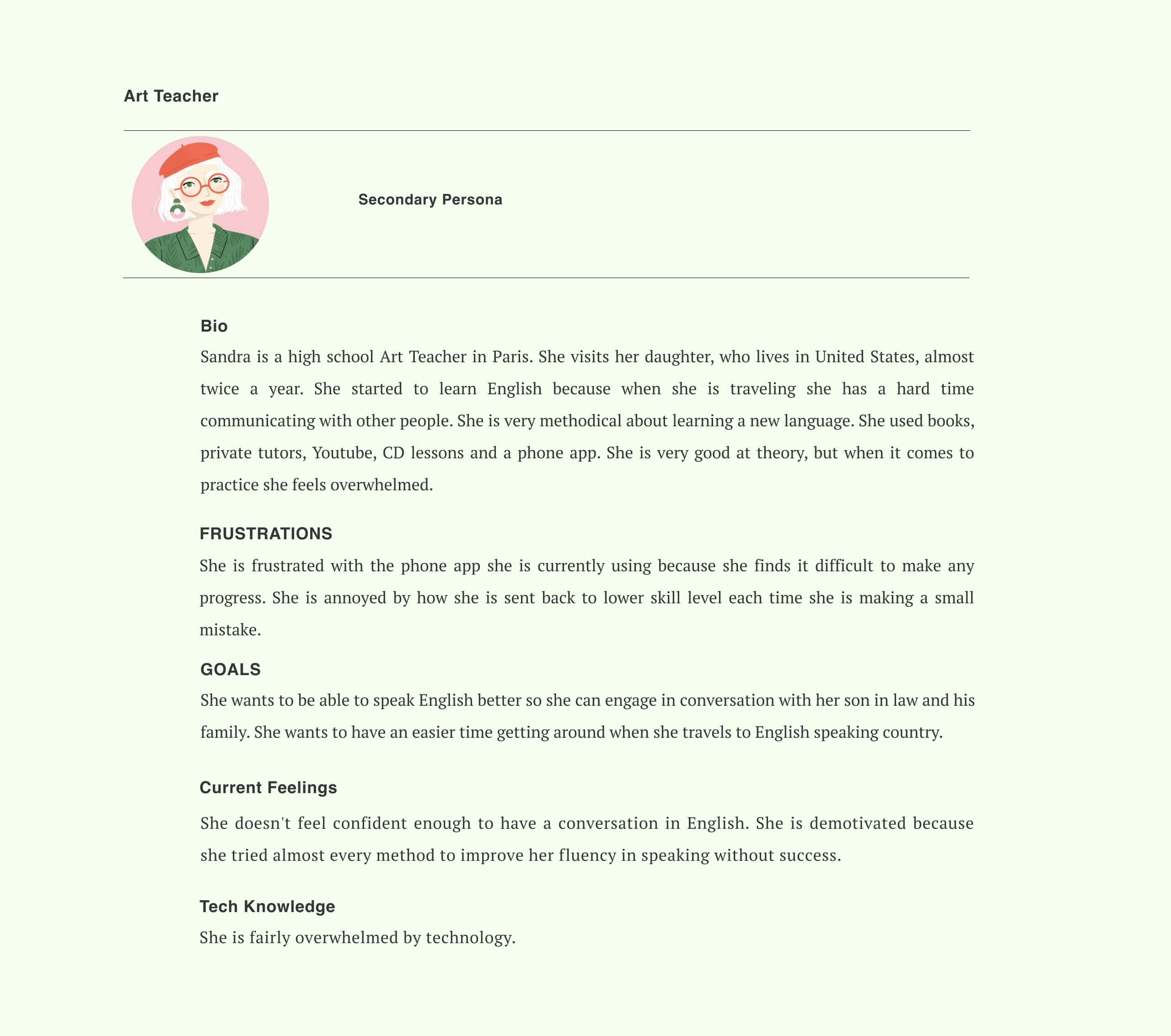
We developed two personas based on the interviews and used them throughout the product development process.These personas were derived from the insights gathered during the interviews and served as a guide throughout the project.
Our personas, Linda and Sandra, sought a means to improve their speaking skills in a target language. They lacked confidence in speaking despite using language learning apps. By defining detailed profiles, goals, frustrations, current emotions, and technological aptitude for our personas, we utilized their insights to inform our design choices.
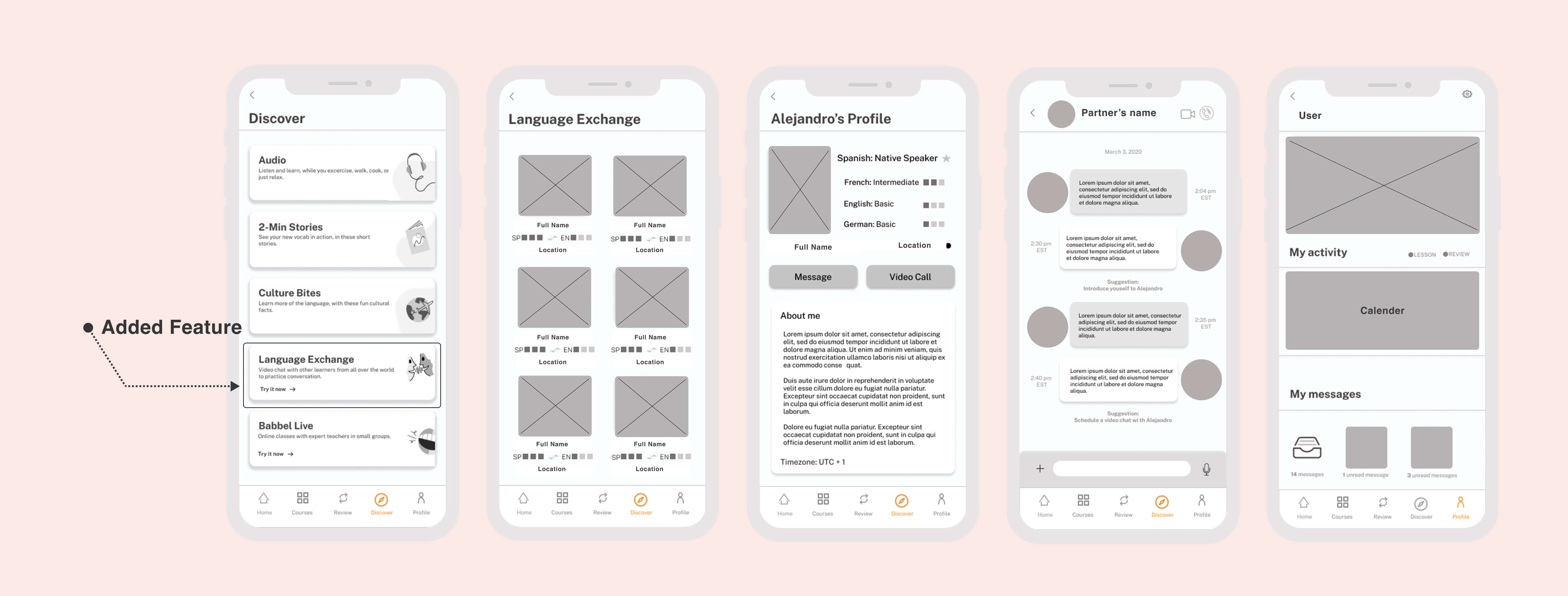
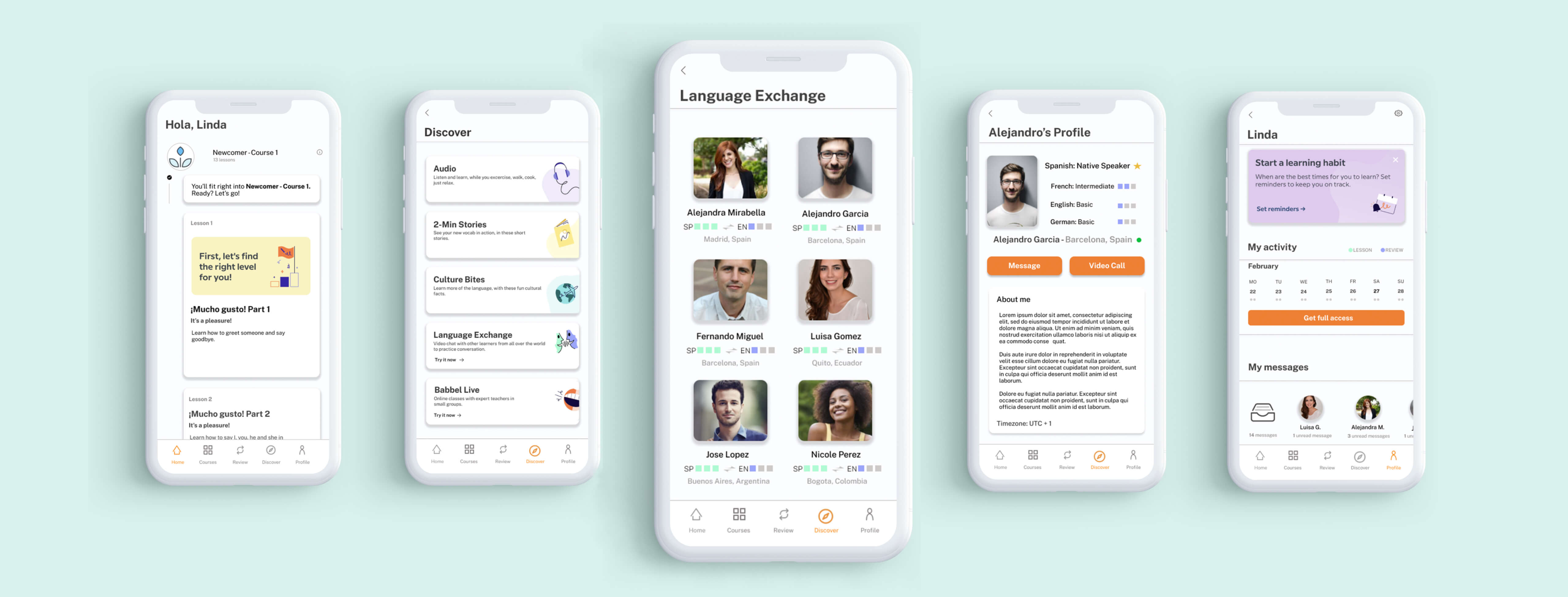
By incorporating a virtual language exchange feature, our aim is to enhance the learning experience for users. Language exchange entails the chance to engage in conversations with native speakers of the target language, and we believe this will greatly benefit our users.
3-Ideate and Develop the Solution
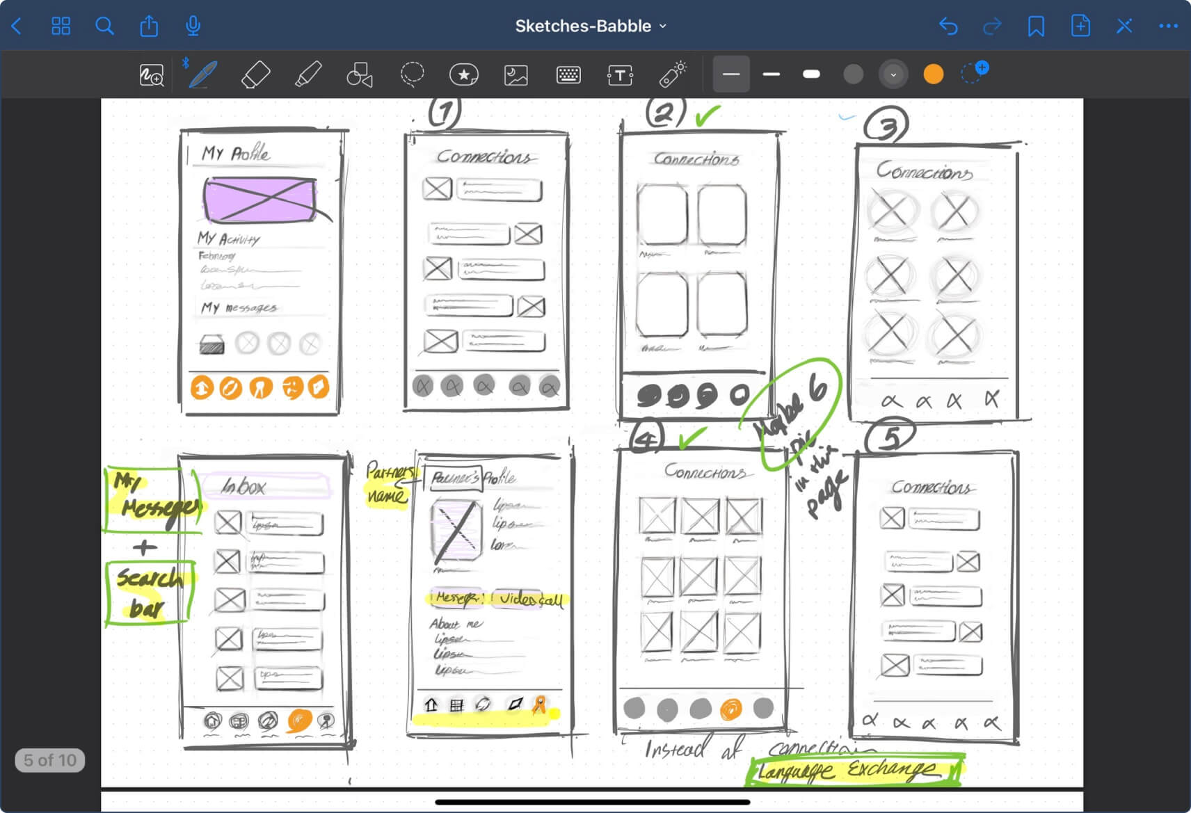
We utilized the Figma software, which offers amazing collaborative features for teamwork, to create mid-fidelity and high fidelity mockups and prototypes.
Babble Style Guide:
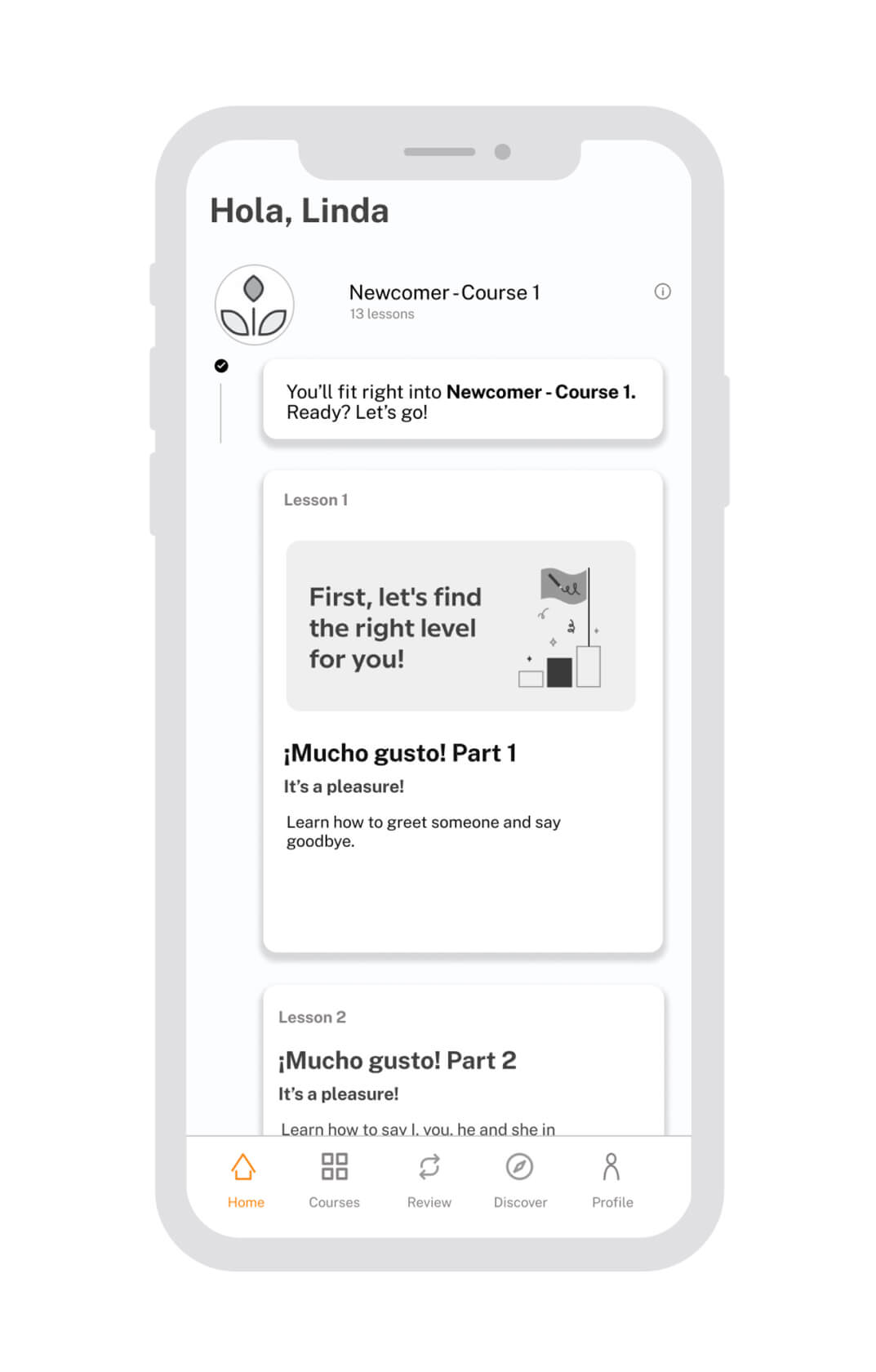
Following that, we started to work on the the final screens. We strictly followed the existing visual guidelines of the Babbel app.
4-Prototype
5-Testing our Design
We conducted a second round of testing to uncover potential usability issues with the prototype.
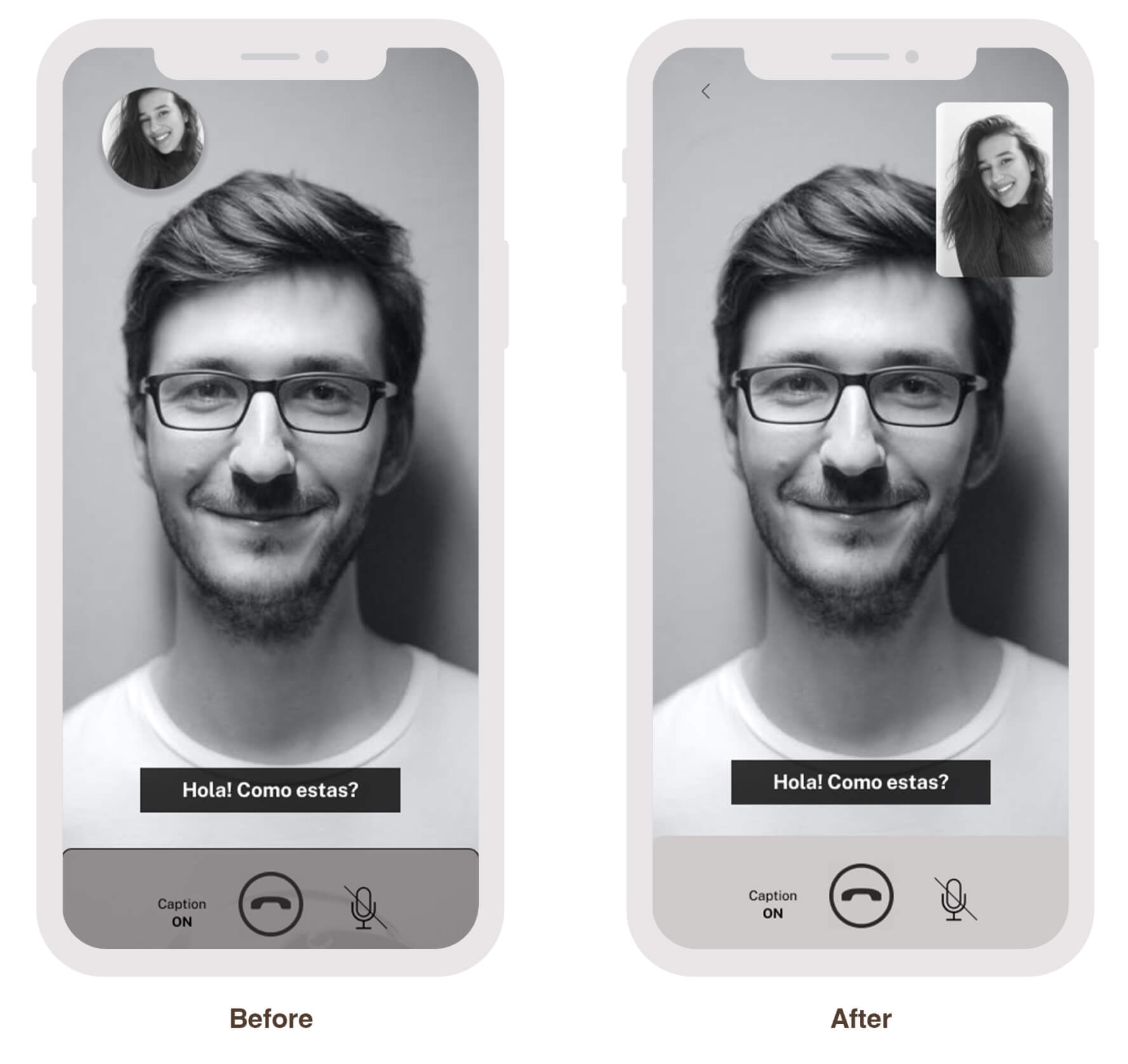
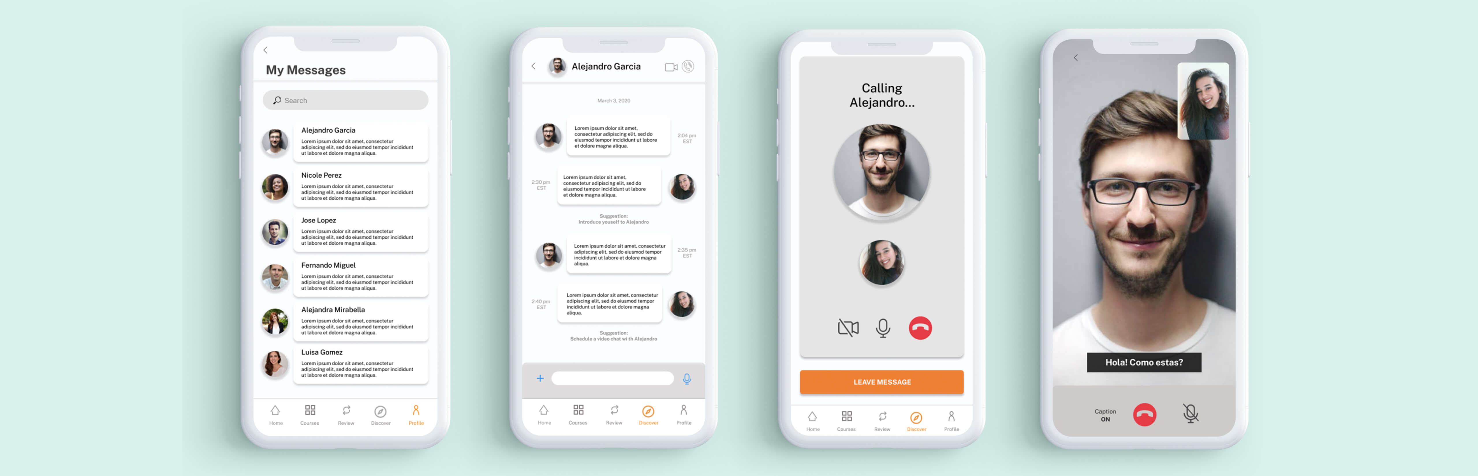
- After discovering the Language Exchange feature, users could navigate to initiate a video call in under 30 seconds
- Users speculated that the Language Exchange feature could be integrated within the Courses tab
- The lessons displayed on the home page were deemed repetitive by users
- Locating messages within the Profile tab was not perceived as intuitive by users.
Final Evaluations
In case this project progresses further, there are several additional aspects we would like to investigate in subsequent iterations:
- Incorporating a shortcut to the inbox on the Home screen
- Enhancing the visibility of the Language Exchange feature
- Conducting further usability tests to evaluate the impact of the new design changes.