Overview
RxStars is a peer recognition tool initially developed by Massachusetts General Hospital Emergency Medicine residents as an MVP web application named "Nailed it".

The initial application's design was outdated compared to competitors and provided a poor user experience. Our stakeholders' goal was to improve the original concept for use in their hospital and generate a new stream of revenue.
We conducted 4 weeks of design sprints utilizing the design thinking methodology to create a user-friendly design system with new features catering to user needs. User research led us to develop a mobile app. We eventually delivered a fully functional prototype that enables healthcare workers to give shoutouts to their colleagues and maintain an emotional connection with them.
To begin, We conducted user and market research. Ted Hui (teammate) led the analysis, while I sketched ideas based on our ideation session for a new design system and logo. We all collaborated to create hi-fi mock-ups, and Mary Winkelman (teammate) built the functional prototype. We all contributed to usability testing and design iterations.

Design Process
1-Empathize with Users
Healthcare providers face high levels of stress and burnout, worsened by the COVID-19 pandemic. Our client, a group of emergency medicine residents initiated a peer recognition project to boost workplace morale within their group, with the goal of expanding it to the entire hospital and app store market. This was where we stepped in to facilitate this goal.
We began with the findings in related articles:
- Study: longer hours = higher burnout (Stimpfel, Sloane & Aiken, 2012)
- 12-hour shifts = more stress, anxiety, exhaustion than 8-hour (Jennings, 2008)
- 91% experience burnout in medical field (Kelly & Lefton, 2017)
- 57% consider leaving healthcare (Kelly & Lefton, 2017)
User Research
We conducted video interviews with 10 users including physicians, nurses and nurse practitioners to develop a rich understanding of their pain points.

Pain Points
-
Key Findings:
- Burnout is a significant issue among physicians
- Hospitals often neglect the well-being of their staff
- Positive feedback can have a strong impact
- Quick and easy recognition of peers is essential
- Ability to control the visibility of my comments (public/private) is necessary
Competitive Analysis
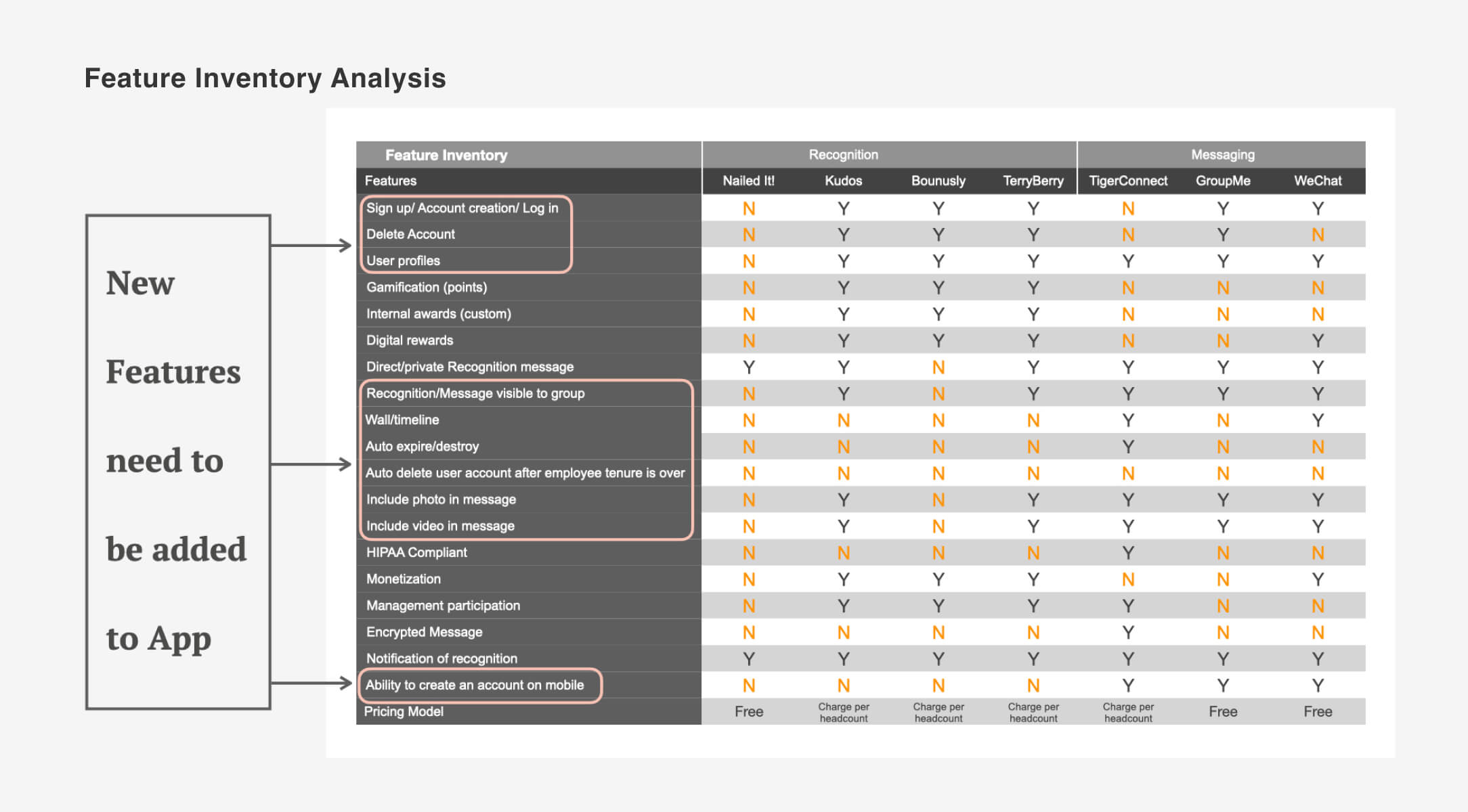
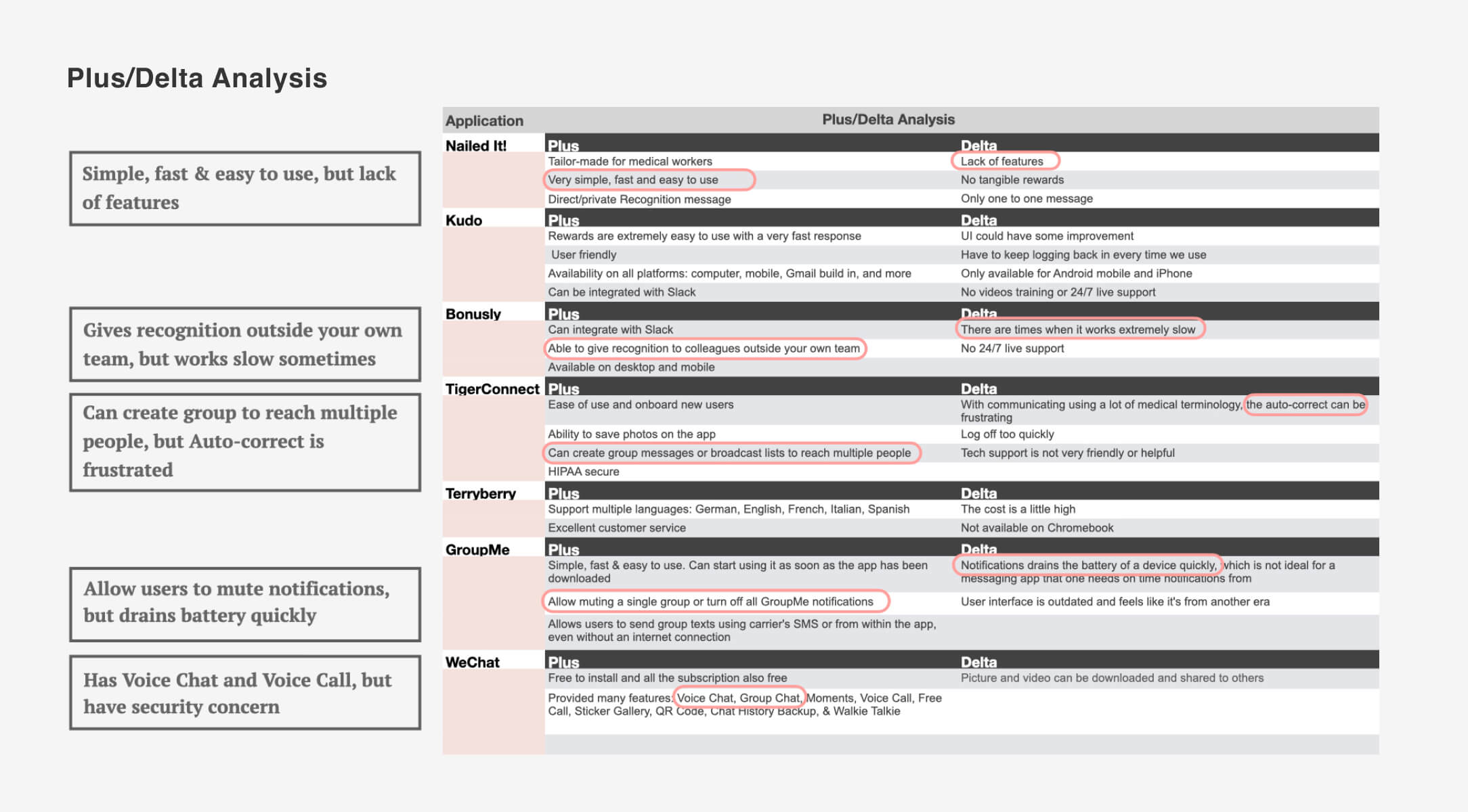
After exploring the issue, we researched other mobile apps with similar purpose and identified four recognition apps and three messaging apps. We compared their features to gain insights.
2-Define the Problem
-
In this step we:
- Defined the problem statement based on the insights gained from the research.
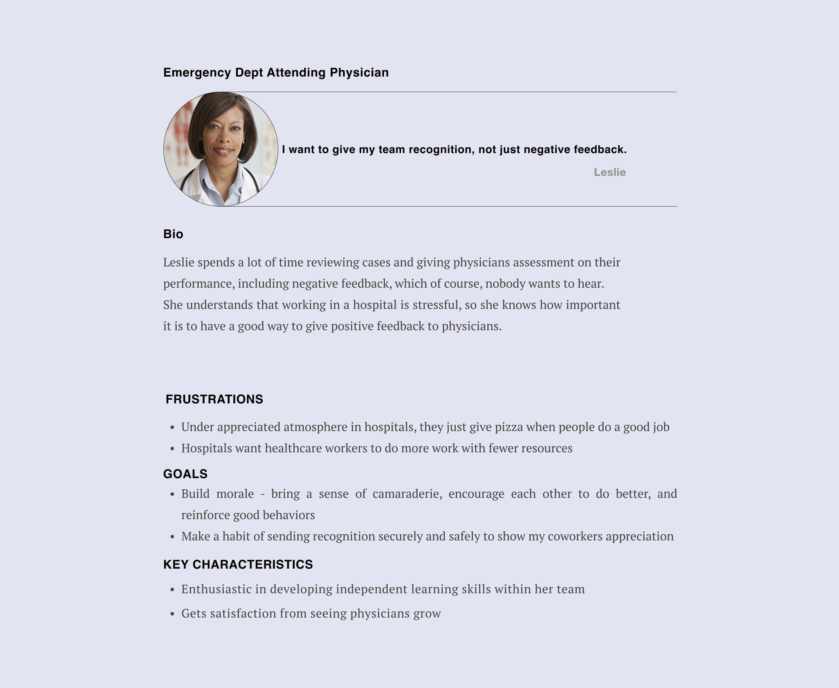
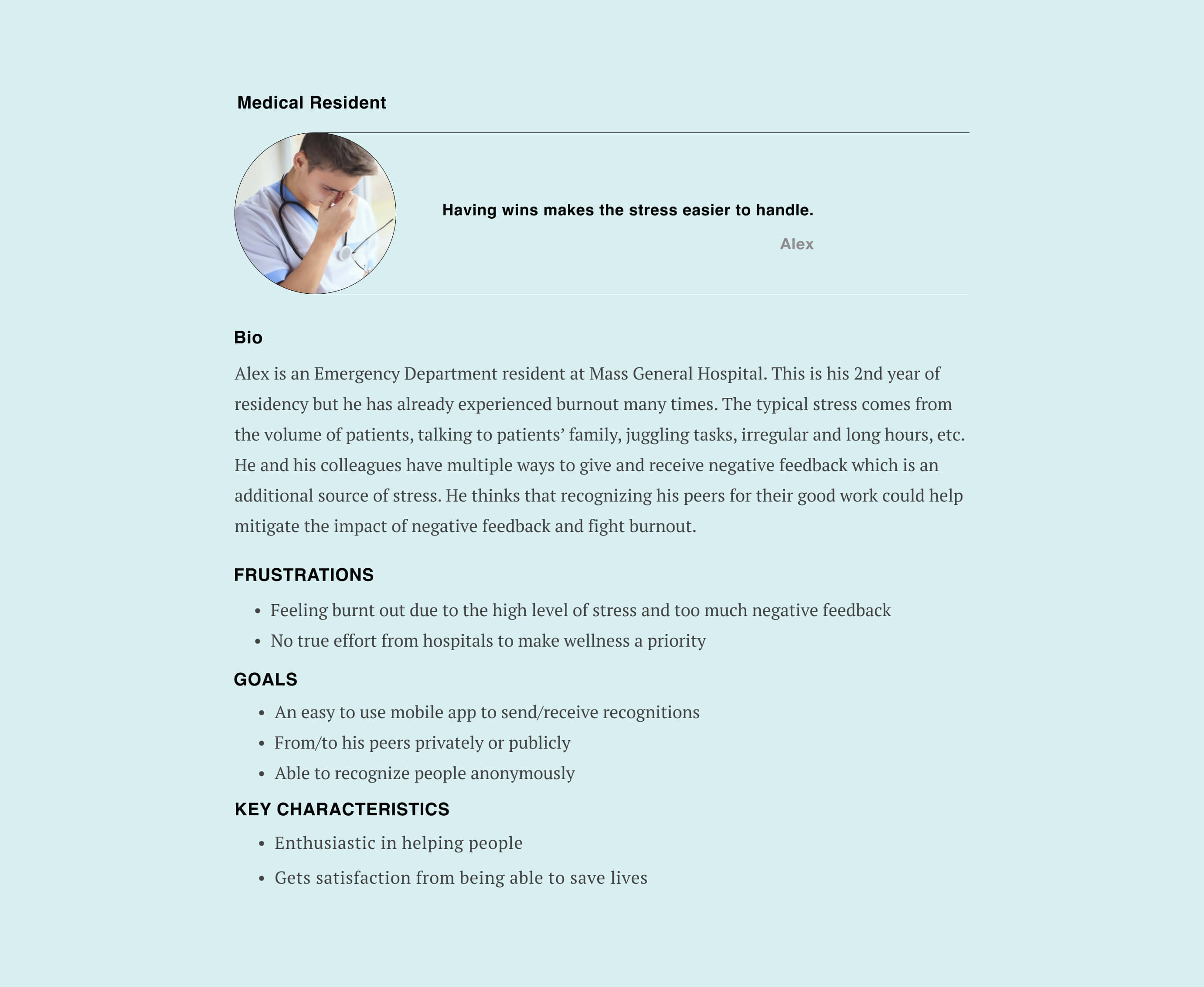
- Developed user personas and scenarios to represent the target users and their goals.
- Identified the technical requirements that must be met in order to create a successful product.
3-Ideate and Develop the Solution
-
Our Proposed Improvements:
- User interface redesign to make it more appealing and user-friendly.
- Ability to send and receive recognition and debriefing among peers both privately and publicly.
- Option to send recognition messages anonymously.
- Multimedia (images, audio, and video clips) incorporation into the messages.
- Safe and secure platform to protect sensitive patient information.
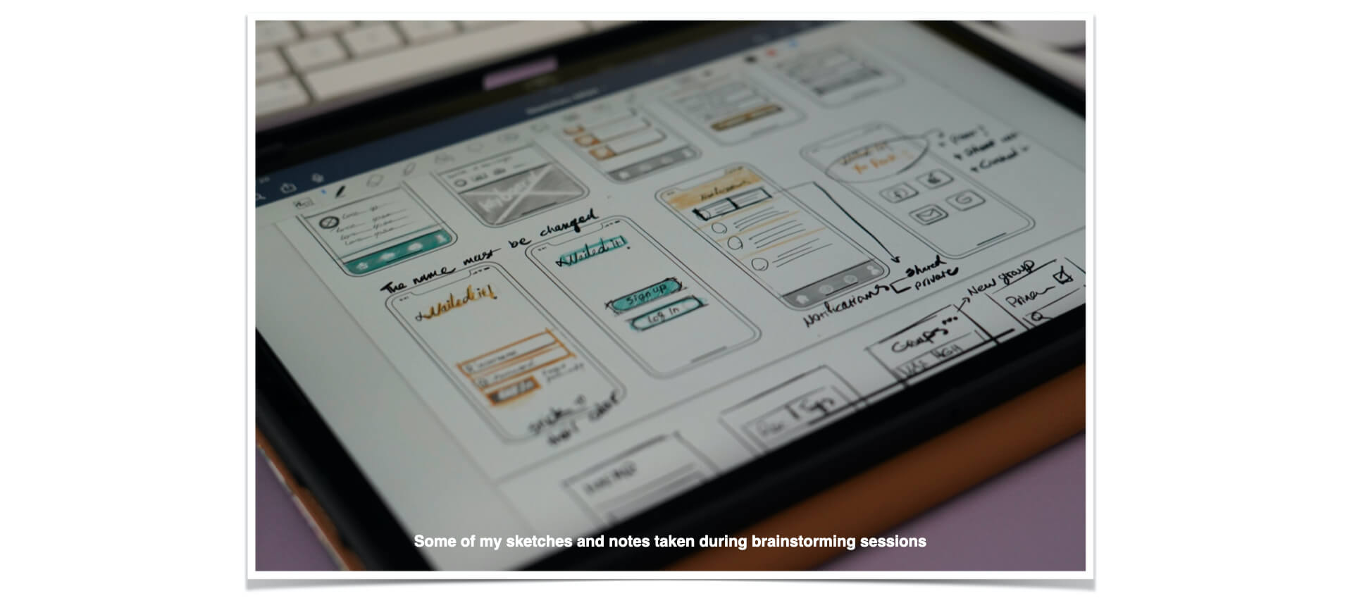
Prior to creating High-Fidelity Mockups, our team established the app's branding elements including color, name, and typography. We raised concerns about the potential negative connotation of the existing name during client meetings. After brainstorming, the clients voted on "RxStars" (Rock Stars) as the new name.
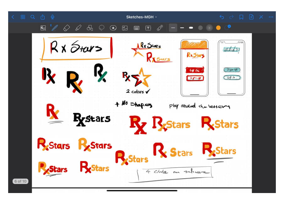
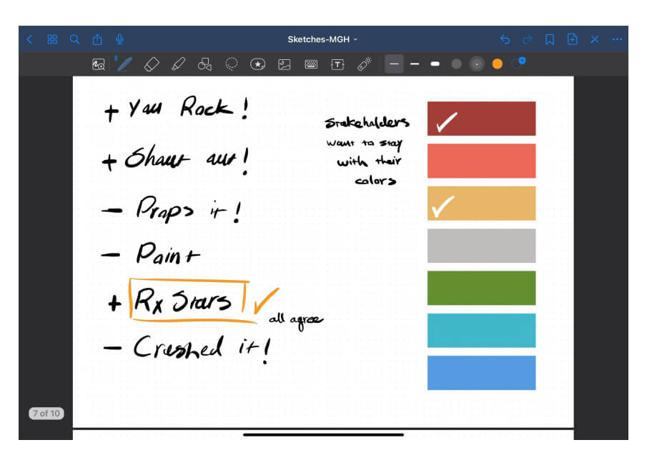
I redesigned the logo based on client feedback for a fresh look while preserving the brand colors.

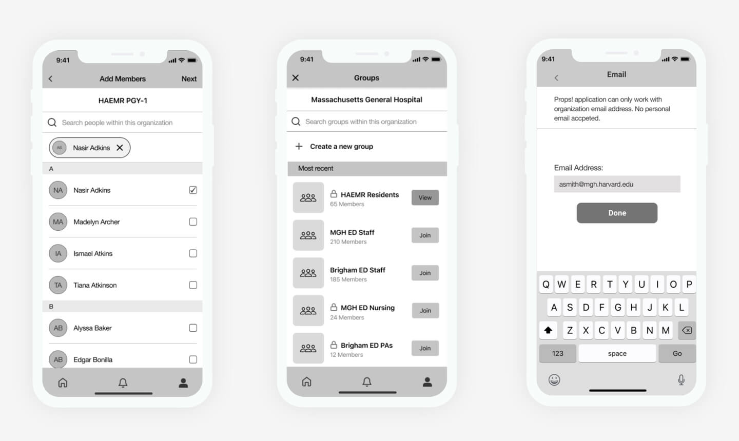
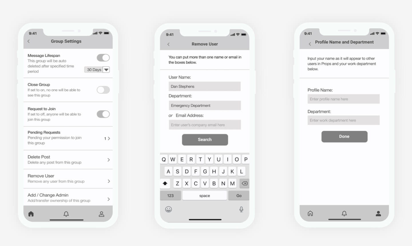
Afterward, we collaborated using Figma software to create mid-fidelity mockups and conduct initial testing with users for early feedbacks.
4-Prototype
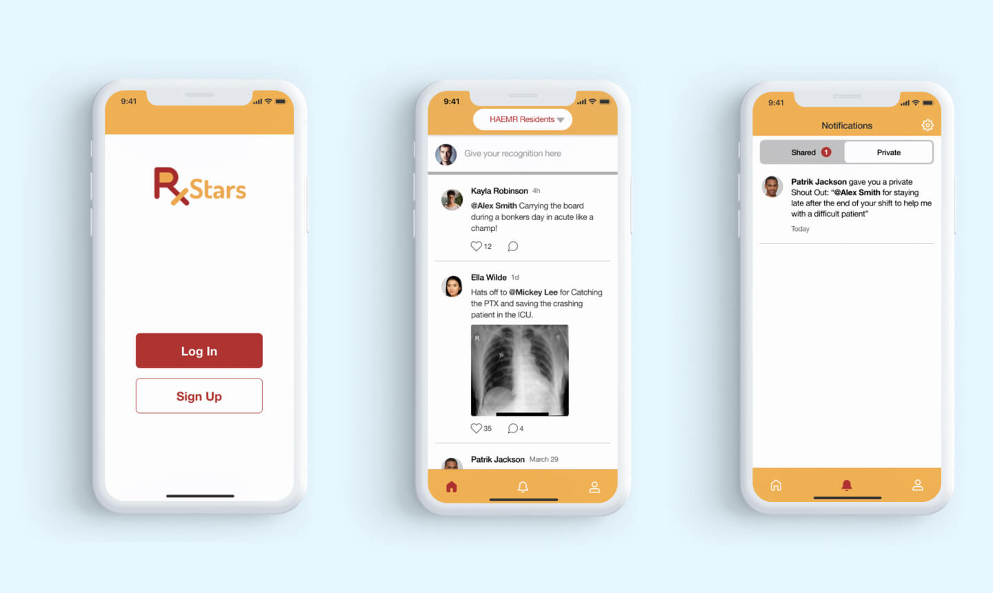
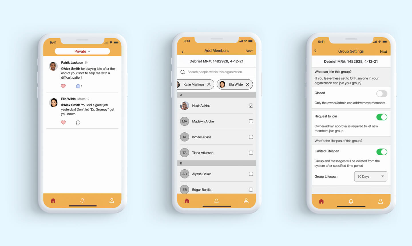
Our team member Mary initiated the development of prototype, while Ted and I were creating high-fidelity mockups based on the Mid-fidelity versions.While doing this project, we had to jump between different stages of the design thinking process.
Demo of the Final Prototype
5-Testing our Design
The app has been enhanced with new features, such as a user-friendly account signup process, messaging options that allow for privacy, public, and anonymous sending, and a "Wall" page where users can share their emotions, struggles, and thoughts.
We observed successful task completion by all testers, and identified areas for improvement during the usability testing sessions. These improvements were incorporated into our final deliverables.
Below you can see some of these changes resulting from the usability test sessions:


Final results
Our redesigned app improved task completion time by 30 seconds, resulting in a 25% improvement rate. Improved task efficiency and ease-of-use led to increased user satisfaction. The quote down below is from our Stakeholders: "The design team did an amazing job bringing our vision to life. The app looks and feels fantastic, and we're confident our users will love it."
The major lesson that I learned from this project is the importance of collaboration and communication. Working in a team requires active listening and effective communication to ensure that everyone is aligned and working towards the same goal. It's important to understand that design is not a solitary activity but a collaborative effort that requires input from multiple stakeholders.
Potential Future Enhancements:
To improve functionality and user experience, we identified potential enhancements:
- Ensuring HIPAA compliance to protect user privacy and information
- Adding encrypted messaging to provide an extra layer of security for sensitive conversations
- Creating a higher level administrator dashboard to enable report generation and analysis based on app usage
This project provided an incredible hands-on experience in UX design for me.